OVERVIEW
Real estate investment is an increasingly popular way for individuals to achieve financial security. It is an exciting and emotional experience but usually complicated. While there are plenty of blogs and agencies providing information, often, buyers new to the market may struggle to get started without professional guidance and waste time viewing properties out of their range. This app will provide home buyers with the expertise needed to get started efficiently and is created to help them find their perfect home.
I believe that my previous experience in house hunting as a newbie and natural curiosity on the subject helped me to create a pleasant and comprehensive platform for home buyers - Perfect Properties. It bridges the gap between potential buyers especially newbies and the feeling of being lost without being sure of - to step in or not, into the world of investing in an asset this big.
The main differentiating factors of Perfect Properties with other apps out there in the market are:
1) Guided search option is the rescue for people who do not have time to explore a real estate app to enter their search criteria or even for those who just relocated to a new town/city, as it suggests location based on user preferences with the help of a wider and smart search parameters unlike the search with basic criteria that other apps offer out there.
2) It's the ability to custom curate the newest/available homes in the market and be able to view a match percentage to the search criteria along with the ability to compare it with other properties that makes it a really unique app.
3) Well if the above two features aren't enough we have yet another differentiating factor. One can even specify a radius from a location around which he/she wants to find his/her perfect property. Especially it is useful for people who search for homes within a certain mile radius from their work/school locations. Now that's cool!! Isn't it?
CHALLENGE
To develop a responsive app that provides unseasoned buyers, who need access to reliable, uncomplicated information about their potential property investments and want to get a feel for a place by viewing comprehensive information about the property and its neighborhood before spending time on-site, with an effortlessly efficient customizable interface to find their perfect home.
ROLE
UI / Wireframes (low, mid + high), Responsive Mockups, Animation and Mobile Prototype
TOOLS
Sketch, Invision, Axure, Balsamiq, Flinto and Zeplin
WHO ARE WE DESIGNING FOR?
As an IT consultant for a growing tech company, Rashida is frequently on the go, and often holds meetings by phone in her car while driving. She is good at multitasking and relies heavily on technology to help her with this.
PERSONA GOALS
● Rashida makes a good living and wants to invest in property beyond the city for increased financial security for her family.
● She wants to find the right information for fast decision-making.
● She wants a tool to help her find the right properties so as not to waste her time.
“I want to provide my family with financial security. I’ve been considering buying property for a while, and am looking for a tool that can help me find what I’m looking for, quickly!”
USER STORIES
● As a user, I want to create a profile containing all my property criteria, so that I am recommended results most relevant to me.
● As a user, I want to be able to search and filter properties, so that I can find good matches based on my needs.
● As a user, I want to be able to save or mark properties I am interested in, so that I can easily revisit them.
● As a user, I want access to as much written and visual information as possible about properties I’m . interested in, so that I can make an informed decision.
● As a user, I want to be able to contact the right people if I am interested in viewing a property, so that I schedule a viewing.
● As a user, I want to see how well a property meets my criteria or compares to other properties, so that I can refine my options.
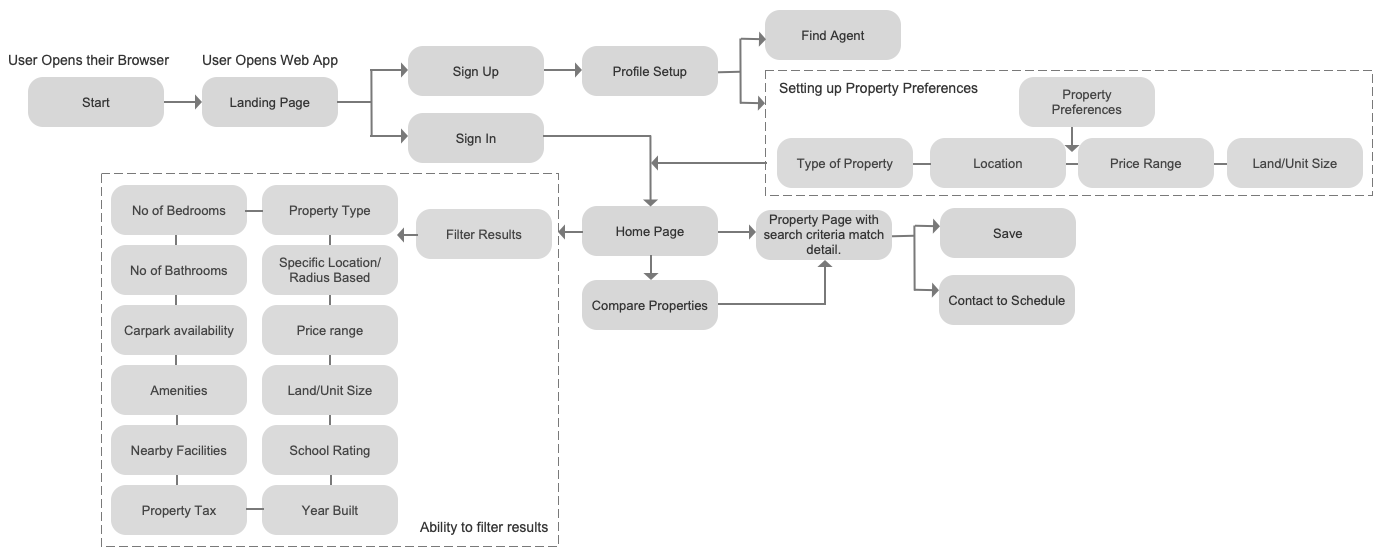
USER FLOW DIAGRAM
I started off by conducting a competitive analysis on the top rated real estate apps and interviewed a few of my friends and family to get to know what the users expect out there and it helped me identify the users motivation and needs. Based on this and the project brief, the key features were identified and was turned into a user flow. The goal was to create a real estate app that would make the property hunt for you, a breeze.
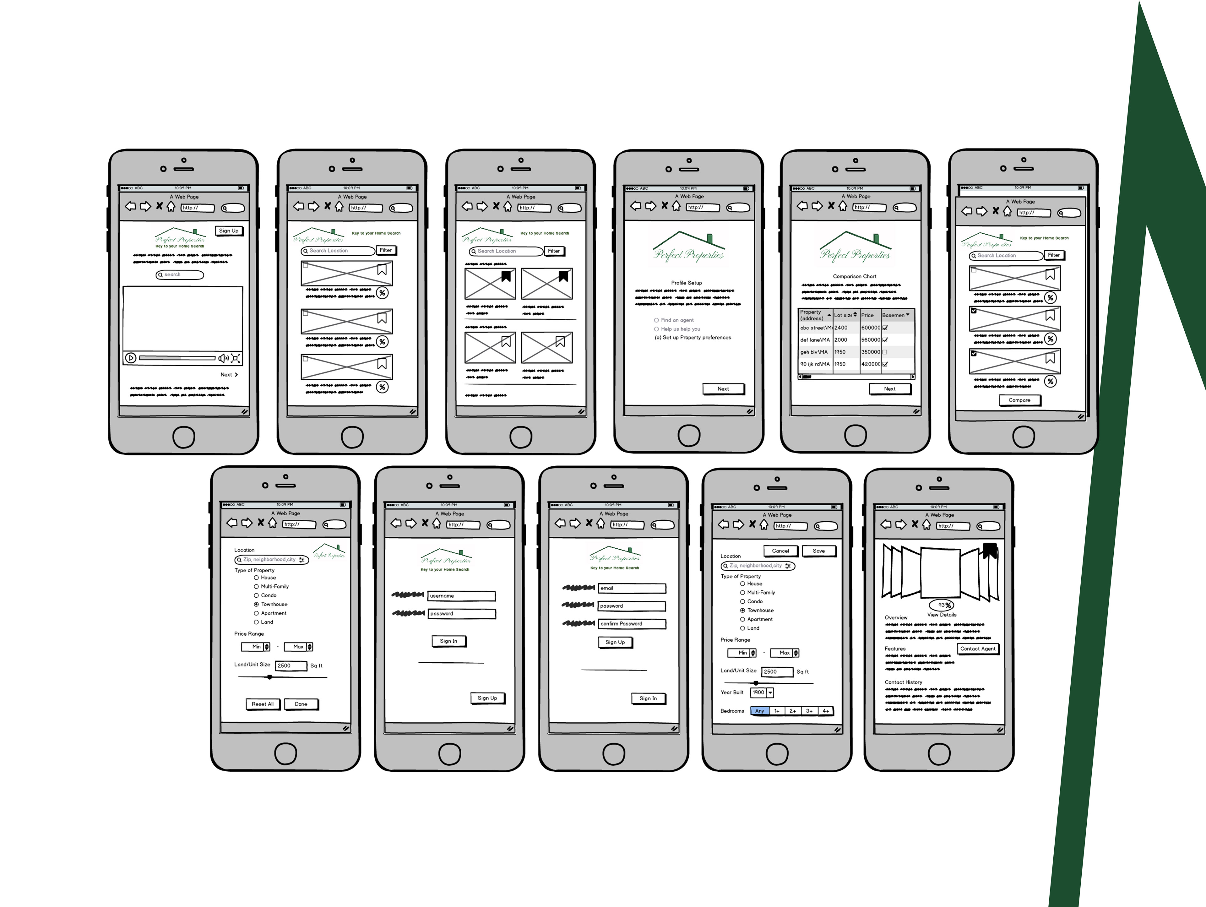
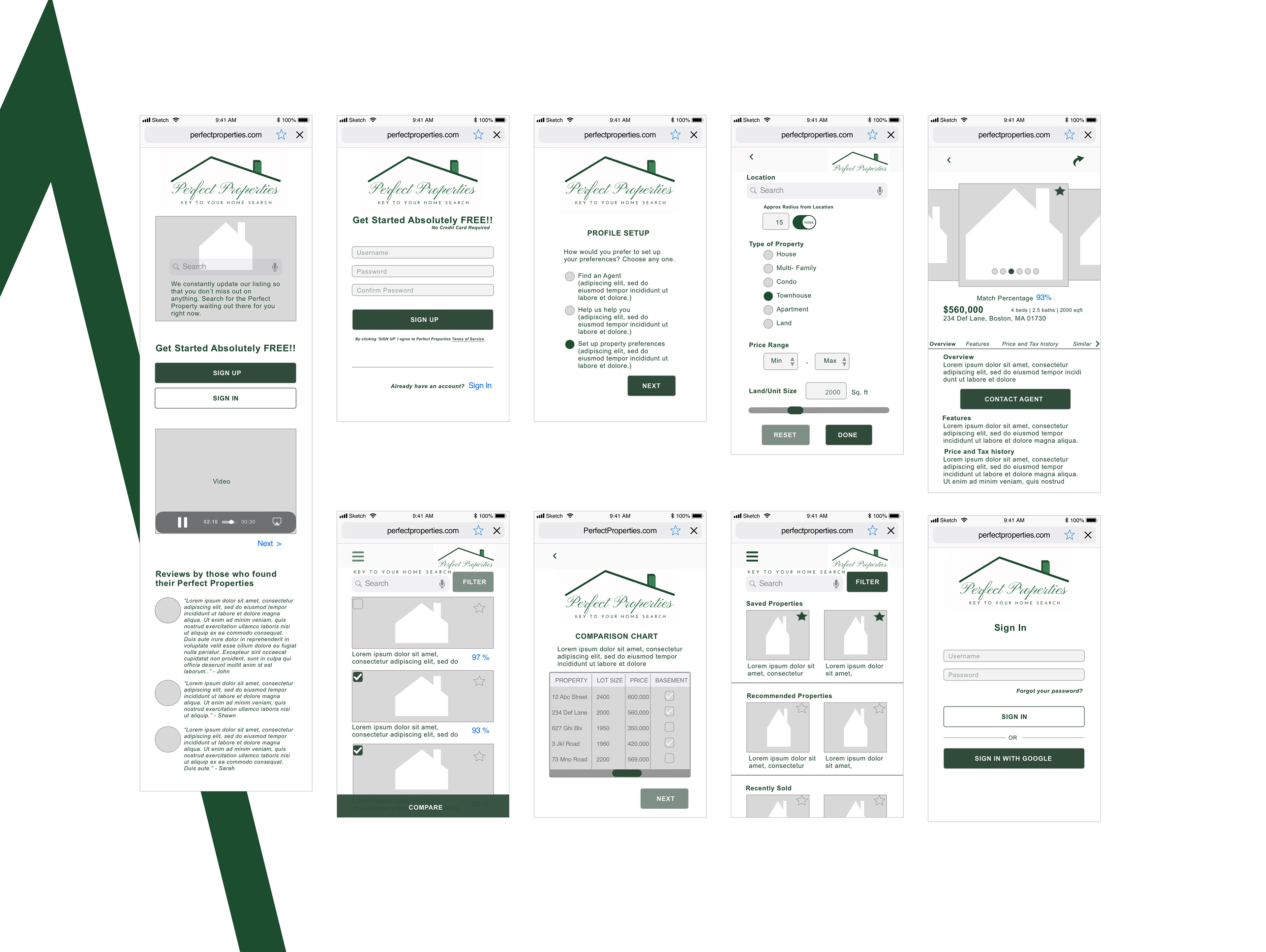
LOW FIDELITY WIREFRAMES
Based on the user flow, I designed a few rough sketches and later transformed them into industry standard low fidelity wireframes using Balsamiq. This is the stage where I started identifying interaction patterns and element behavior.
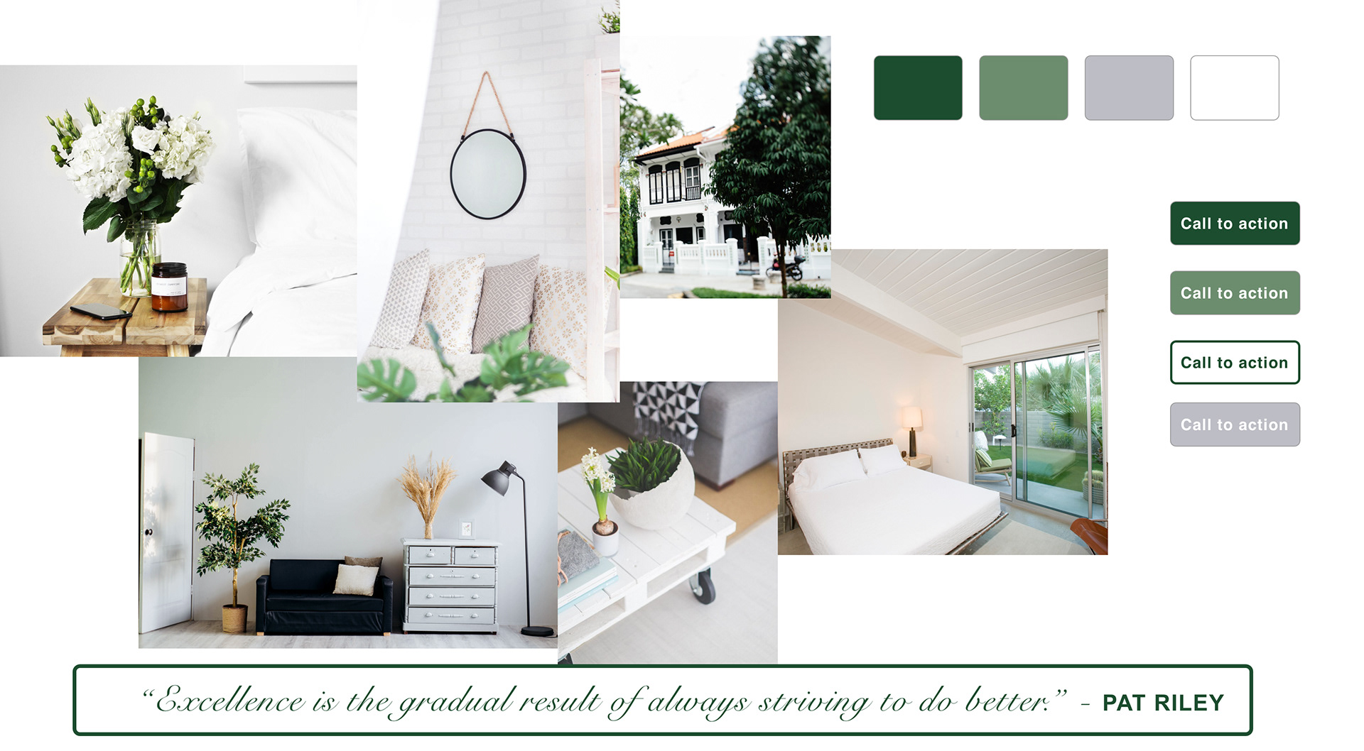
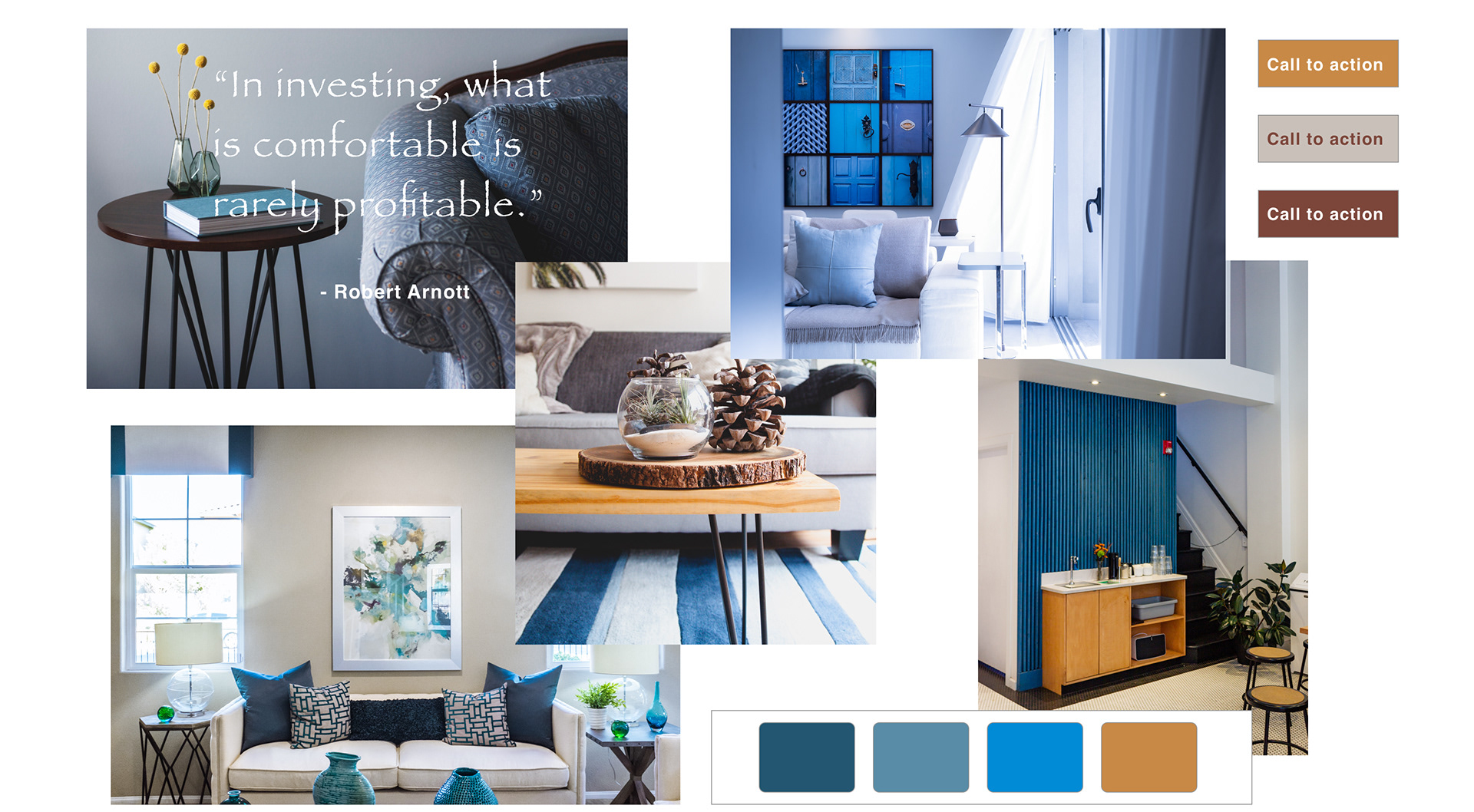
MOODBOARD
Once my low fidelity wireframes were all set, I tried out two mood boards to see which one aligns well with the project brief. Based on my findings and understanding the green moodboard works best for displaying the properties as it has a classy and natural appearance along with a clean light visual that most people may associate with a home and a feeling of relaxation. Moreover, in the brief it states that Rashida lives with her family in a city on the east coast, and spends most weekends in the countryside and she loves hiking, which indirectly implies that she has a fascination towards nature. Hence, I believe the green and grey shades aligns more closely with the brief of the project as compared to the blue moodboard.
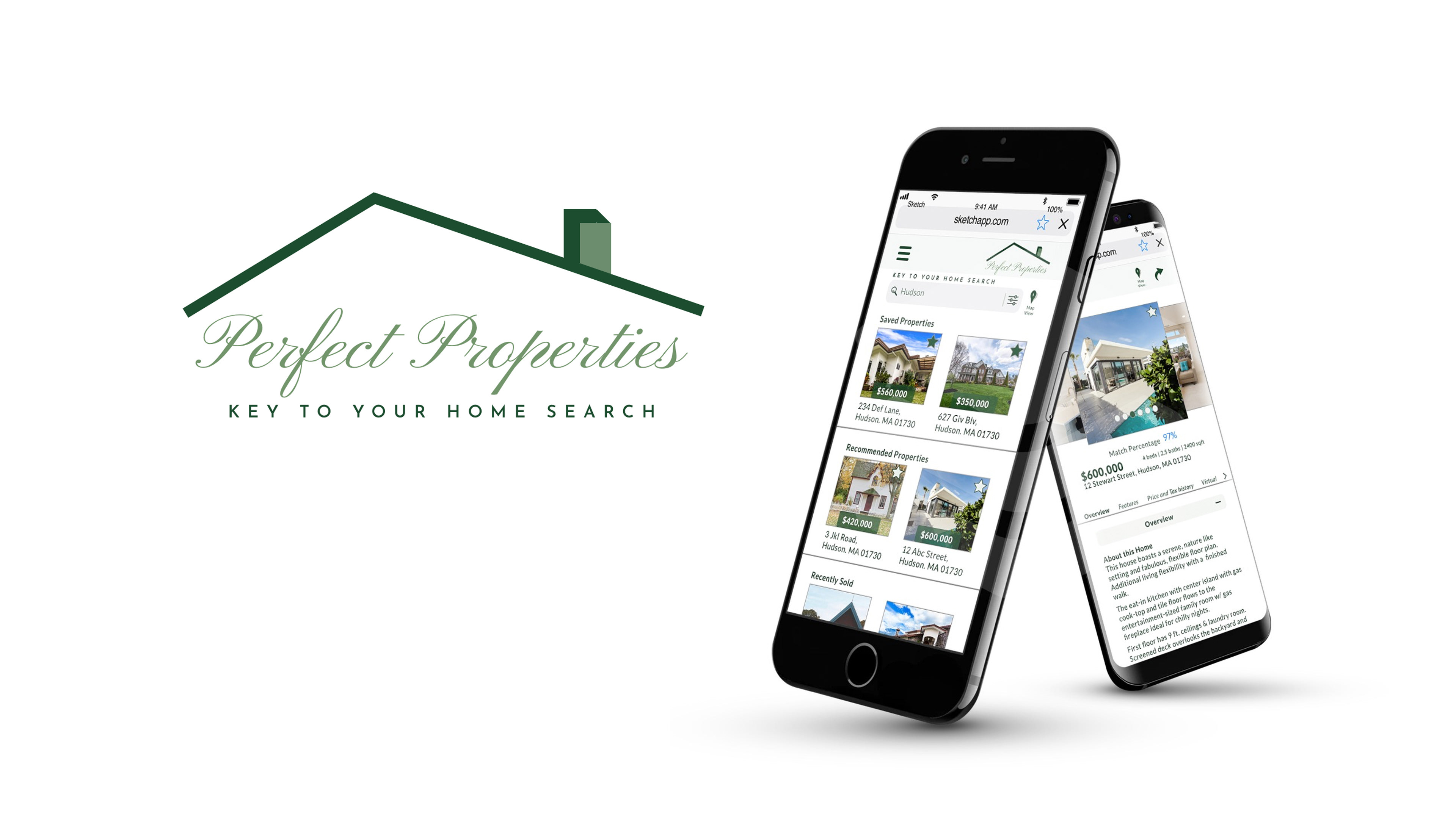
Here is a snapshot of few screens with appropriate mood being implemented. With its unique features it surely is going to revolutionize the real estate industry.

MID FIDELITY WIREFRAMES
After some thoughtful iterations I applied hierarchy, spacing and design principles to create a few mid fidelity wireframes on Sketch.
GESTURES, INTERACTIONS & ANIMATION
As far as gestures are concerned, it mostly consists of scrolling and tapping. Pinching for zooming in on the map view would be a great addition. Alternatively, there is a stepper with a + and - for a controlled zoom in or zoom out effect. Subtle interactions are used like Push Left/Right, Dissolve and Instant for different transitions.
In future iterations, the inclusion of a few haptics for notifications, errors, and confirmations would be an attractive enhancement. Here, you can preview the animated version of few of the interactions and gestures created using Flinto. It is simple but yet engaging.
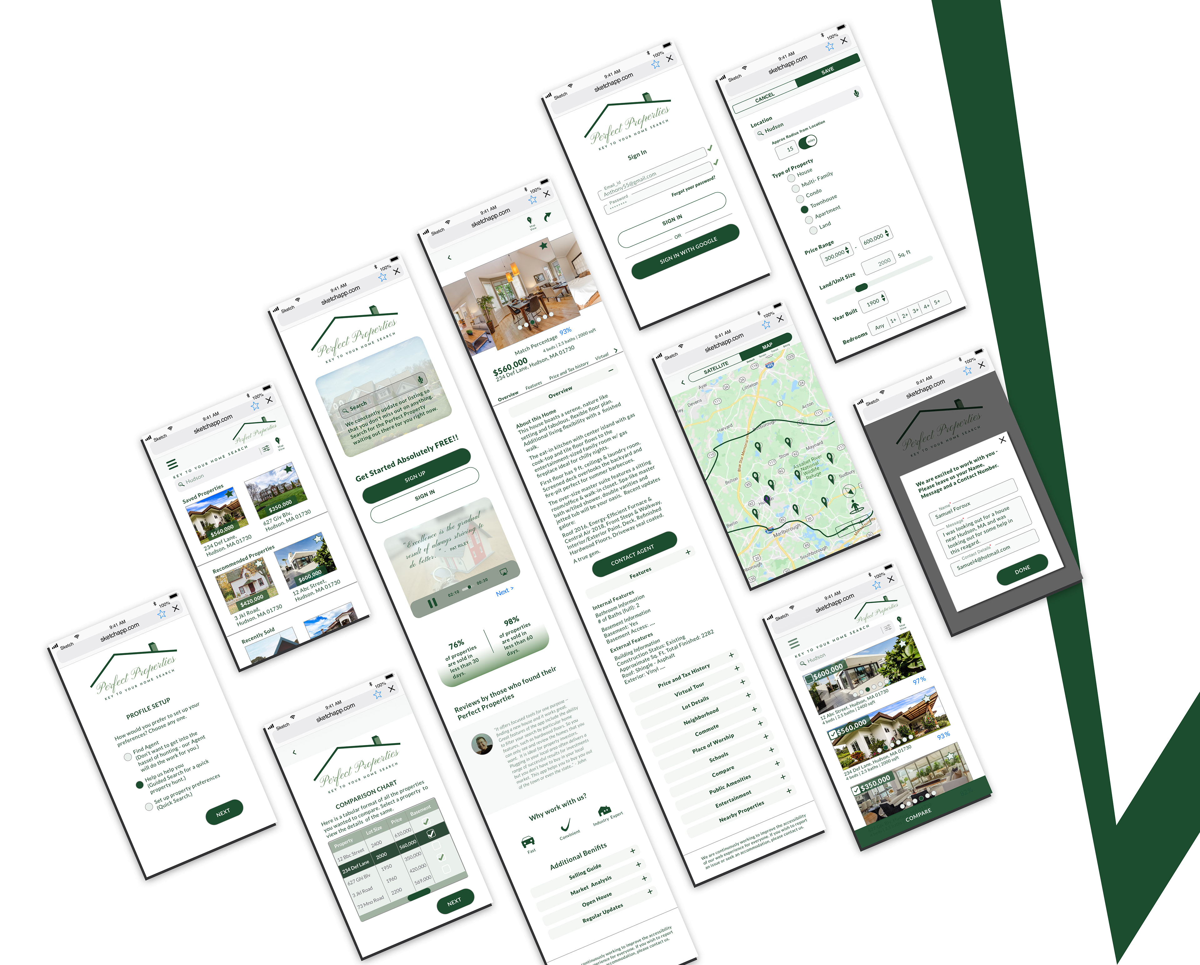
HI FIDEITY WIREFRAMES
STYLE GUIDE
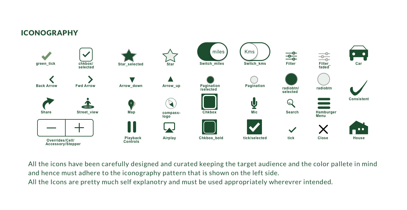
All design decisions about colors, typography, and other elements adheres to creating an app that feels natural, luxurious and classy. This image shows a snapshot of one part of the style guide- Iconography.
To view the complete Design Style Guide click Here.
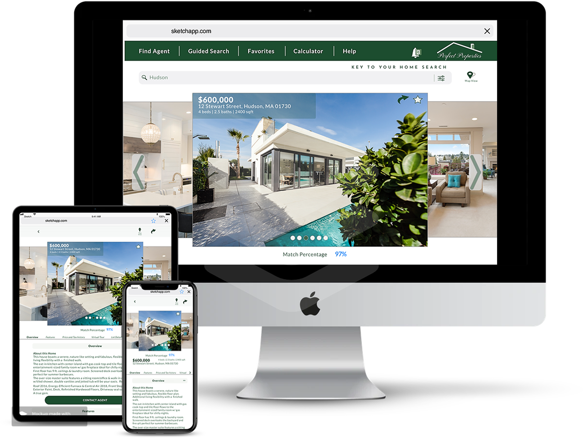
RESPONSIVE WEB UI MOCKUPS
Following the mobile-first approach, it was time for me to introduce new breakpoints as my mobile design started to look fragmented, in-cohesive, and inaccessible on larger breakpoints. I decided to keep the grid columns(12) the same for consistency across breakpoints and created well-adjusting design patterns - navigation and layout for all sizes - mobile, tablet, and desktop.
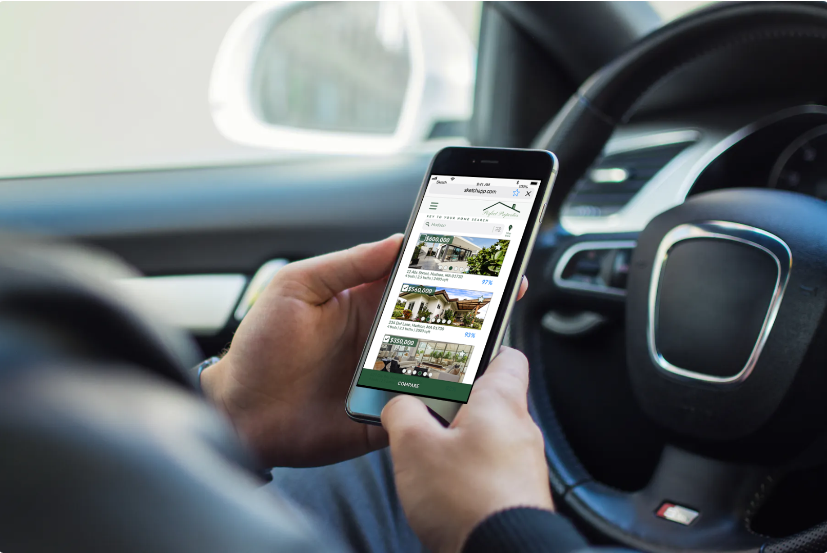
Here’s an example of a presentation mockup on multiple screens, which really gives the viewer a great idea about how the app's property page will appear across actual devices:
PROTOTYPE
